How to Read a Commodity Chart?
Master commodity chart reading with our complete guide. Learn candlesticks, support/resistance, technical indicators (RSI, MACD), and how to identify trading opportunities like a pro.
Staring at a commodity price chart can feel like trying to read a foreign language. Those candlesticks, lines, and indicators might look intimidating, but they're actually telling you a story—a story about supply and demand, trader psychology, market momentum, and potential price movements. Learning to read these charts is one of the most valuable skills you can develop as a commodity investor or trader.
Whether you're tracking gold prices to time a purchase, monitoring oil to understand energy markets, or analyzing agricultural commodities for investment decisions, chart reading helps you make informed decisions instead of blind guesses. The good news? You don't need to master every technical indicator or become a professional trader to benefit from basic chart reading skills. This guide will teach you the essentials—how to read candlesticks, identify support and resistance, use key indicators, and recognize patterns that signal potential opportunities.
Commodity Chart Reading at a Glance
Essential Elements
4 Core Components
Candlesticks, Support/Resistance, Trends, Volume
Learning Time
1-2 Weeks
For practical understanding
Best Timeframe (Beginners)
Daily Charts
Less noise than intraday, clearer patterns
Top Indicators
MA, RSI, MACD
Moving Averages, RSI, MACD most useful
Quick Start: Learn candlesticks first → Identify support/resistance → Add moving averages → Practice on SpotMarketCap charts
Understanding Chart Basics: What You're Actually Looking At
Before diving into specific patterns and indicators, let's understand what a commodity chart actually shows you and why it's structured the way it is.
The Anatomy of a Price Chart
Every commodity price chart has the same basic structure:
- X-Axis (Horizontal): Represents time. Depending on the timeframe you select, each point might represent a minute, hour, day, week, or month.
- Y-Axis (Vertical): Represents price. Higher on the chart means higher prices; lower means lower prices.
- Price Action: The movement of price over time, shown through various chart types (line charts, bar charts, or candlestick charts).
- Volume: Usually displayed at the bottom of the chart, showing how much trading activity occurred during each period.
Choosing Your Timeframe
The same commodity can look very different depending on the timeframe you're viewing:
- Intraday charts (1-minute, 5-minute, 15-minute): For active day traders making multiple trades per day. Very noisy and prone to false signals for beginners.
- Daily charts: Each candlestick or bar represents one trading day. Ideal for swing traders and investors. Provides a good balance of detail and clarity.
- Weekly charts: Each candlestick represents one week. Great for identifying longer-term trends and major support/resistance levels. Less affected by short-term noise.
- Monthly charts: Each candlestick represents one month. Best for understanding multi-year trends and major market cycles.
Recommendation for Beginners: Start with daily charts. They provide enough detail to see meaningful patterns without the overwhelming noise of intraday charts.
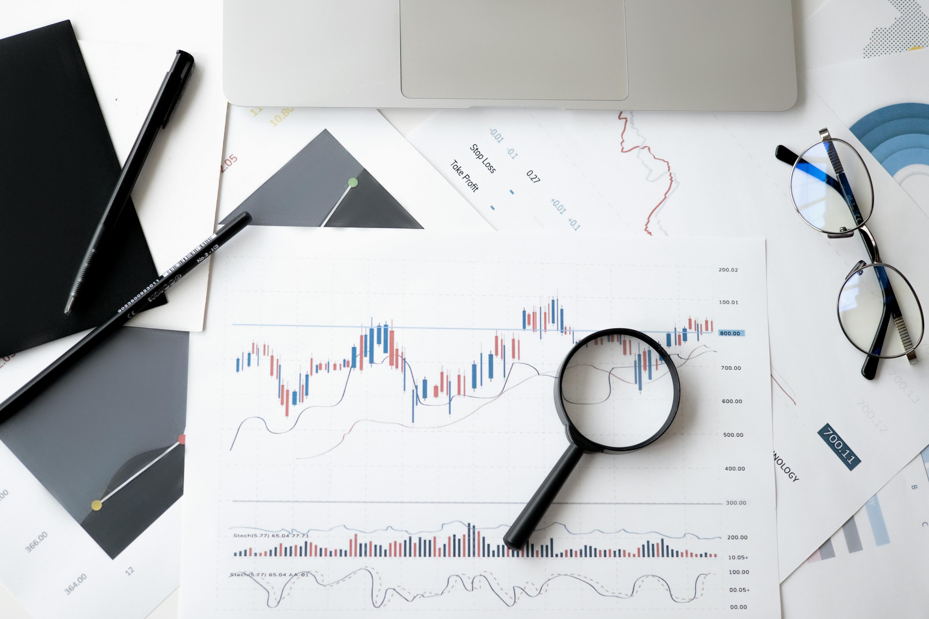
Reading Candlestick Charts: The Foundation of Technical Analysis
Candlestick charts are the most popular and informative chart type for commodity analysis. They provide more information than simple line charts and are easier to read than bar charts.
What a Single Candlestick Tells You
Each candlestick shows four critical price points for a specific time period:
- Open: The price at the beginning of the period
- Close: The price at the end of the period
- High: The highest price reached during the period
- Low: The lowest price reached during the period
The Candlestick Components:
- The Body: The thick part of the candle represents the range between open and close. A green/white body means the price closed higher than it opened (bullish). A red/black body means the price closed lower than it opened (bearish).
- The Wicks (or Shadows): The thin lines extending above and below the body show the high and low prices. The upper wick shows how far above the open/close the price reached. The lower wick shows how far below the open/close the price dropped.
What Candlestick Patterns Reveal About Market Psychology
Individual candlesticks tell you about the battle between buyers and sellers during that specific period:
- Long green body, small wicks: Strong buying pressure throughout the period. Buyers controlled the action from start to finish.
- Long red body, small wicks: Strong selling pressure. Sellers dominated.
- Small body, long upper wick: Buyers tried to push prices higher but failed. Sellers rejected the higher prices, pushing them back down. Often bearish.
- Small body, long lower wick: Sellers pushed prices lower but buyers stepped in and pushed them back up. Often bullish.
- Very small body with wicks on both sides (Doji): Indecision. Buyers and sellers are in balance. Often signals potential reversal when appearing after trends.
Important Candlestick Patterns to Know
Multiple candlesticks together form patterns that signal potential future price movements:
Bullish Patterns (Suggesting Upward Movement):
- Hammer: Appears at support levels. Small body at top, long lower wick. Shows sellers pushed price down but buyers rejected the low and drove it back up. Signals potential upward reversal.
- Morning Star: Three-candle pattern at support. Large red candle, followed by small indecisive candle, followed by large green candle. Indicates sellers exhausted, buyers taking control.
- Bullish Engulfing: Two-candle pattern where a large green candle completely engulfs the previous red candle. Shows strong shift from selling to buying pressure.
Bearish Patterns (Suggesting Downward Movement):
- Shooting Star: Appears at resistance levels. Small body at bottom, long upper wick. Shows buyers pushed price up but sellers rejected the high and drove it back down. Signals potential downward reversal.
- Evening Star: Three-candle pattern at resistance. Large green candle, followed by small indecisive candle, followed by large red candle. Indicates buyers exhausted, sellers taking control.
- Bearish Engulfing: Two-candle pattern where a large red candle completely engulfs the previous green candle. Shows strong shift from buying to selling pressure.
Important Note: These patterns are most reliable when they appear at significant support or resistance levels, which we'll discuss next. A hammer pattern at random price level is less meaningful than one appearing at a strong support zone where price has previously bounced.
Identifying Support and Resistance: The Foundation of Price Levels
Support and resistance are the most important concepts in technical analysis. Master these, and you'll immediately improve your chart reading ability.
What Are Support and Resistance?
Support is a price level where buying pressure has historically been strong enough to prevent further price declines. Think of it as a "floor" where buyers consistently step in, causing prices to bounce higher.
Resistance is a price level where selling pressure has historically been strong enough to prevent further price increases. Think of it as a "ceiling" where sellers consistently appear, pushing prices back down.
Why Support and Resistance Exist
These levels exist because of market psychology and memory. Traders remember where price previously reversed, and they make decisions based on those memories:
- At previous support levels, traders who wished they had bought last time are waiting to buy again at that "good price."
- At previous resistance levels, traders who got stuck buying at the high are waiting for another chance to sell and get out at breakeven.
- These collective memories create self-fulfilling prophecies where levels become important simply because enough traders believe they're important.
How to Identify Support and Resistance
Finding support and resistance is more art than science, but here's a systematic approach:
- Look for horizontal price levels where price has reversed multiple times: The more times price has bounced off a level, the stronger that support or resistance becomes.
- Connect previous highs for resistance, previous lows for support: Draw horizontal lines at prices where the commodity has repeatedly struggled to move beyond.
- Think in zones, not exact prices: Support and resistance are rarely precise single prices. They're usually zones spanning several dollars or cents. A price might bounce anywhere in a $2,000-2,020 zone for gold, for example.
- Pay attention to round numbers: Psychological levels like $50, $100, $2,000, etc., often act as support or resistance because traders tend to place orders at these round figures.
- Previous resistance becomes new support (and vice versa): When price finally breaks through resistance, that level often becomes support on subsequent pullbacks. Similarly, broken support often becomes resistance if price tries to rally back.
Using Support and Resistance for Trading Decisions
Support and resistance levels help you make better entry and exit decisions:
- Buying near support: When price approaches a strong support level, consider it a potential buying opportunity, especially if combined with bullish candlestick patterns.
- Selling near resistance: When price approaches resistance, consider taking profits or avoiding new long positions, especially if bearish candlesticks appear.
- Breakouts: When price decisively breaks through resistance with strong volume, it often continues higher. Similarly, breaking support often leads to further declines.
- Stop-loss placement: Place protective stop-losses just beyond support (for long positions) or just above resistance (for short positions) to limit losses if your analysis proves wrong.
Recognizing Trends: The Direction of Price Movement
"The trend is your friend" is one of the oldest trading axioms for good reason. Trading with the trend significantly improves your odds of success.
The Three Types of Trends
- Uptrend: Characterized by higher highs and higher lows. Each rally peak is higher than the previous peak, and each pullback low is higher than the previous low. Indicates buying pressure is dominant.
- Downtrend: Characterized by lower highs and lower lows. Each rally fails at a lower level than the previous one, and each selloff reaches a new low. Indicates selling pressure is dominant.
- Sideways/Range-Bound: Price bounces between defined support and resistance levels without making significant progress in either direction. Indicates equilibrium between buyers and sellers.
Drawing Trendlines
Trendlines visually represent trends and help identify when they might be changing:
- Uptrend line: Connect successive higher lows with a straight line. This line acts as dynamic support. As long as price stays above this line, the uptrend remains intact.
- Downtrend line: Connect successive lower highs with a straight line. This line acts as dynamic resistance. As long as price stays below this line, the downtrend remains intact.
- Breaking a trendline: When price breaks through an established trendline, it often signals a trend change or at least a significant pause in the trend.
Essential Technical Indicators for Commodity Charts
Indicators are mathematical calculations based on price and volume that help you identify trends, momentum, and potential reversals. You don't need dozens of indicators—just a few reliable ones.
Moving Averages: Smoothing Out Price Action
Moving averages calculate the average price over a specific number of periods, creating a smooth line that helps you see the trend without all the daily noise.
Common Moving Averages:
- 50-day Moving Average: Shows intermediate-term trend. When price is above the 50-day MA, the intermediate trend is up. When below, it's down.
- 200-day Moving Average: Shows long-term trend. Widely watched by institutional traders. Breaking above or below the 200-day MA is considered significant.
- 20-day Moving Average: Shows short-term trend. More responsive to recent price changes.
How to Use Moving Averages:
- Trend identification: Price above MA = uptrend; price below MA = downtrend
- Dynamic support/resistance: Moving averages often act as support during uptrends and resistance during downtrends
- Crossovers: When a shorter MA (like 50-day) crosses above a longer MA (like 200-day), it's called a "golden cross" and signals potential upward momentum. The opposite is a "death cross" signaling potential downward momentum.
RSI (Relative Strength Index): Measuring Momentum
RSI measures the speed and magnitude of price movements on a scale from 0 to 100. It helps identify when a commodity might be overbought (too expensive, due for pullback) or oversold (too cheap, due for bounce).
How to Read RSI:
- RSI above 70: Overbought territory. The commodity has rallied strongly and may be due for a pullback or consolidation. Consider taking profits or avoiding new long positions.
- RSI below 30: Oversold territory. The commodity has sold off strongly and may be due for a bounce. Consider it a potential buying opportunity, especially at support levels.
- RSI between 30-70: Neutral zone. No overbought or oversold signal.
- RSI divergence: When price makes a new high but RSI makes a lower high (bearish divergence), it suggests weakening momentum and potential reversal. The opposite (bullish divergence) occurs at lows.
Important Note: During strong trends, RSI can stay in overbought or oversold territory for extended periods. Don't blindly sell just because RSI is above 70 if a powerful uptrend is in progress.
MACD (Moving Average Convergence Divergence): Trend and Momentum
MACD combines trend-following and momentum by comparing two moving averages. It consists of the MACD line, signal line, and histogram.
How to Read MACD:
- MACD line crosses above signal line: Bullish signal suggesting upward momentum. Consider buying.
- MACD line crosses below signal line: Bearish signal suggesting downward momentum. Consider selling.
- MACD above zero: Generally bullish, indicating short-term momentum is stronger than longer-term momentum.
- MACD below zero: Generally bearish.
- Histogram expanding: Strengthening momentum in the current direction.
- Histogram contracting: Weakening momentum; potential reversal or consolidation ahead.
Volume: Confirming Price Movements
Volume shows how much trading activity occurred during each period. It's crucial for confirming the strength of price movements.
How to Use Volume:
- Rising prices on high volume: Strong bullish signal. Many buyers are participating, confirming the upward move.
- Rising prices on low volume: Weak signal. Few participants; the move may not be sustainable.
- Falling prices on high volume: Strong bearish signal. Heavy selling pressure.
- Falling prices on low volume: Weak signal. Limited selling; may just be a pause rather than a real reversal.
- Breakouts on high volume: When price breaks support or resistance on heavy volume, the breakout is more likely to continue.
- Breakouts on low volume: False breakouts that often reverse quickly.
Why Learning to Read Commodity Charts Matters for Your Success
Reading commodity charts isn't just an academic exercise—it's a practical skill that directly impacts your investment results and financial decisions:
- Better Entry and Exit Timing: Instead of buying or selling at random times, you can identify optimal entry points near support with bullish patterns and exit points near resistance with bearish signals. This timing difference can improve returns by 10-20% or more annually.
- Avoid Buying Tops and Selling Bottoms: Chart reading helps you recognize when a commodity is overextended (overbought) or oversold, preventing emotional decisions to buy at peaks or panic-sell at bottoms. This skill alone can save you from catastrophic timing mistakes.
- Understand Market Context: Charts show you whether you're fighting a strong downtrend or riding a powerful uptrend. Trading with the trend dramatically improves your probability of success compared to fighting against it.
- Risk Management: Identifying support and resistance allows you to place intelligent stop-losses that give your positions room to work while protecting against large losses. This structured risk management is essential for long-term success.
- Confidence in Decisions: When you understand what the chart is telling you, you make decisions based on analysis rather than fear or greed. This confidence helps you stick to your plan instead of making impulsive changes.
The difference between investors who can read charts and those who can't is dramatic. Chart readers know when gold is approaching major support and might bounce, when oil is breaking out of a multi-month consolidation, or when agricultural commodities are showing weakening momentum despite rising prices. This knowledge transforms you from a reactive investor who follows headlines into a proactive trader who spots opportunities before they become obvious to everyone else.
Putting It All Together: A Practical Chart Reading Process
Here's a step-by-step process for analyzing any commodity chart:
- Start with the weekly or monthly chart: Identify the long-term trend and major support/resistance levels. This gives you the "big picture" context.
- Move to the daily chart: Look for the intermediate-term trend and more precise support/resistance zones. Check if price is approaching any major levels identified on the weekly chart.
- Identify the current trend: Is it uptrend, downtrend, or sideways? Remember: trade with the trend, not against it.
- Mark key support and resistance levels: Where has price reversed multiple times? What are the recent highs and lows? Where are round number levels?
- Check the indicators: What do moving averages show? Is RSI overbought, oversold, or neutral? Is MACD bullish or bearish? Does volume confirm recent price moves?
- Look for candlestick patterns: Are there any reversal patterns at key support or resistance levels? Any continuation patterns suggesting the trend will persist?
- Synthesize the information: Does the overall picture suggest a buying opportunity, selling opportunity, or better to stay on the sidelines? Do multiple factors align, or are there conflicting signals?
- Make your decision: Based on the analysis, decide whether to buy, sell, hold, or wait. Set specific entry prices, exit targets, and stop-loss levels.
Common Chart Reading Mistakes to Avoid
Mistake 1: Using Too Many Indicators
Beginners often clutter their charts with dozens of indicators, making analysis paralyzing rather than helpful. Stick to 2-3 reliable indicators rather than trying to use everything.
Mistake 2: Ignoring the Bigger Picture
Focusing only on short-term charts while ignoring the longer-term trend is a recipe for fighting the dominant direction. Always check weekly/monthly charts before making decisions based on daily charts.
Mistake 3: Seeing Patterns Everywhere
Not every price formation is a meaningful pattern. Be selective and focus on clear patterns at significant support/resistance levels rather than finding patterns where none exist.
Mistake 4: Treating Levels as Exact Prices
Support and resistance are zones, not precise prices. Looking for exact price hits often causes you to miss valid setups that occur a dollar or two away from your line.
Mistake 5: Trading Against the Trend
Trying to pick tops and bottoms by trading against strong trends is one of the fastest ways to lose money. Trend-following strategies have much higher success rates than counter-trend strategies.
Related Topics on SpotMarketCap
Conclusion: Chart Reading as Your Competitive Advantage
Learning to read commodity charts transforms you from a passive investor who reacts to news into an informed trader who spots opportunities before they become obvious. While it might seem complex at first, the fundamentals—candlesticks, support/resistance, trends, and a few key indicators—can be learned in just a few weeks of dedicated practice.
Start simple. Open SpotMarketCap charts for commodities you're interested in. Practice identifying candlestick patterns. Draw support and resistance levels. Add a 50-day moving average and RSI. Watch how these elements interact over time. Keep a journal of what you observe and how your predictions play out. Within a month, you'll find yourself naturally reading charts and identifying setups that less experienced investors miss entirely.
Remember: the goal isn't to predict the future with perfect accuracy—no one can do that. The goal is to stack the odds in your favor by identifying high-probability setups where multiple factors align. When you can spot a commodity approaching strong support with bullish candlestick patterns, oversold RSI, and positive MACD divergence, you've found a setup where the risk-reward ratio favors you dramatically.
The markets are always teaching. Your job is to be a diligent student. Every chart you analyze, every pattern you identify, and every trade you make (successful or not) teaches you something valuable. In commodity investing, knowledge truly is profit.
Track Real-Time Asset Prices
Get instant access to live cryptocurrency, stock, ETF, and commodity prices. All assets in one powerful dashboard.
Related Articles

What is Force Majeure? Understanding Contractual Protection in Markets
Comprehensive guide to force majeure in commodity trading and futures contracts. Learn how force majeure works, real-world examples, and how it impacts your trading and investments.

How to Start Investing in Commodities?
Complete beginner's guide to commodity investing. Learn about ETFs, futures, stocks, and physical commodities. Discover the best brokers, strategies, and how to get started with as little as $50.

How to Calculate Commodity Returns?
Master commodity return calculations including roll costs, storage fees, contango/backwardation impact, and total return formulas. Learn why commodity ETF returns differ from spot price changes.